iProbe Knowledge Base


design guidelines for wide format banners & backdrops

when planning a wide format banner or backdrop for a conference or meeting, you want to make sure that its content:

  1. can be seen and read easily by all participants, no matter where they are seated;
  2. renders well on video and photos.

this can be accomplished by following design guidelines.

keep it simple

use a large enough type size

design text large enough to be viewed from the back of the room.

work with a text scale and visibility chart

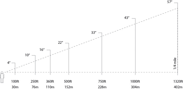
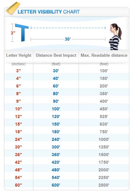
the below Guide Text Scales and Letter Visibility charts help designer calculate how big the type needs to be for readability at different distances. It is a visual guide of the relationship between letter height, distance for best impact and the maximum readable distance.

Guide Text Scale Chart<
Fig1. - Guide Text Scale Chart.
Guide Text Scale Chart
Fig2. - Letter Visibility Chart.

hands-on (DIY)


if you need a hands-on practical way to preview the effect of your text/logo size from the desired distance, you can try printing out examples on your printer. Type the logo/text to be as big as a letter-size (8.5"x11") sheet of paper, then step back to the maximum distance your audience will be at the event.

does it seem large enough? Can you see it well? If not, estimate whether you would need to fit the logo on two sheets, or four sheets, and estimate the size that way.

Think of it like this: if you are taking a picture, and a persons head is about 8-12" of space, you would want to make sure the text block is at least this large. If it's as large as someones head, then you can see it. Otherwise it can be anywhere from 2-3' wide.
example


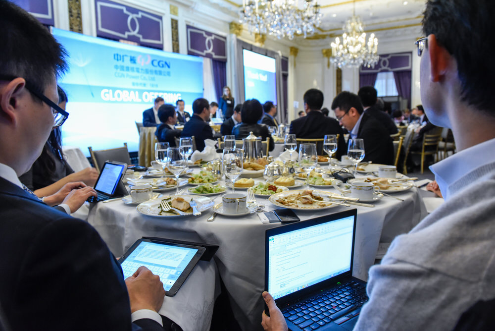
For example, a typical global IPO roadshow setup will have the banner or backdrop placed in front of a room with 100 participants and positioned at a distance of about 50 feet from the back of the room.

There will be a small stage in the front of the room. Five panelists will be seated behind the head table and a presenter will be speaking from a lectern to the left of the table. The banner will be placed behind the presenters. The bottom few feet of space mostly be covered by the tablecloth and the panelists. There will also be some open space from the top of the ceiling to one or two feet under the ceiling. The designer should have all the necessary space information to design graphics and text that will be visible to the audience.

global ipo roadshow

following these design guidelines, keeping the design simple and the type size large enough the banner will be readable from far away and look good on photo and video.